Wow. That’s a lot of labels.
I’m beginning to notice that there are two schools of thought among bike manufactures on how to incorporate their names into the graphics they put on their bikes. On the one hand, you’ve got the traditionalists. The traditionalists like to put the company name on both sides of the down tube, with some sort of a logo on the front of the head tube and that’s pretty much it. On the other hand, you’ve got the folks that seemed to have watched too many nascar races and plaster the bike with as many logos as possible – usually all referencing the company that made the bike.
My biggest complaint about the “nascar-esque” group is that, on professional race cars, those logos represent the sponsors that have paid money to have their logos there. Now, given that no one else has ever chipped in money for one of my bikes, then my bikes have only one sponsor – me. So, if I wanted to really make my bike look like a race car, shouldn’t it be plastered with my name only? After all, I’m my own title sponsor – no?
I started thinking back on some of the bikes I personally own or have owned, and evaluating the number of times I can find the company’s name printed on the bike. I came up with some interesting results:
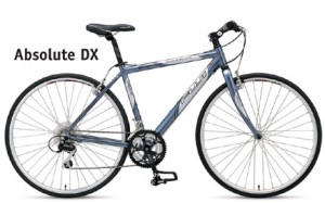
Fuji Absolute DX – I’ve talked about this bike a lot on this site. What I haven’t mentioned are the ridiculous number of times the name “Fuji” appears on the frame and components. It was over 20. Wow. Headtube. Downtube. Seat tube. Seat post. Forks. Handlebars. Seat. Cranks. Chain stays.
Caonnondale R300 – The Fuji’s replacement. With the Cannondale logo on the head tube, the word “Cannondale” itself only appears on the frame 5 times – one quite small just under the junction between the seat tube and the top tube. Well – it also has the acronym “CAAD” on the frame twice, and the ‘C’ stands for Cannondale, so they’ve snuck in an extra two appearances. All in all this feels modest and reasonable.
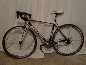
 Look 566 Origin – I guess if there were any of my bikes that deserved to look all “racy” this would be it. And sure enough, you can count the word ‘Look’ on the bike 11 times. This seems to carry over into the rest of the Look lineup too. If you take a look at the latest crown jewel – the Look 695 – you’ll see that it follows the same pattern as my 566. The number of times the name appears is even further exaggerated by the size of the name itself as painted on the bike.
 So I can’t seem to draw a correlation between bike price and the number of times the logo shows up. It isn’t manufactures of more inexpensive bikes trying to make their bikes look more valuable than they actually are, nor is it manufactures trying to make their expensive bikes look … uh … more expensive.
Maybe it is simply just brand choice – specific manufactures preferring to slather their bikes in their own names more often. So I go looking at images on manufacture’s websites of their latest bikes, trying to identify the manufactures that are heavy on logos – maybe considering the less obnoxiously branded bikes for my next new purchase.
No such luck.
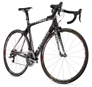
It really appears that the massive-brand labeling aesthetic is catching on across the manufactures. Older Trek bikes were reasonably labled. The latest Madrones look like the latest Look, only with a different four letters in all the same places. My fave above – the Cannondale. Yup – they’ve got one of the longer names in the industry, making each new placement of their logo even more annoying.
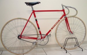
If only there were some way we could combine the beautiful materials design of the modern carbon fiber bikes, with the beautiful paint design of the steel classic steel tube bikes. Now that would be something to see!


 August 10, 2010


 Categories:
  Tags:
Tags: 


